TARGETS
Please stick closely to the intentions of the task before deviating as you are missing key tasks or elements and losing marks.
Act on the red comments then make them green- do not delete them.
Screengrab editing techniques.
When you write about your own work (www and ebi) you need to look more closely and determine exactly what you do well and what needs improvement. At the moment you always write the same thing. Do you meet the success criteria? What subject-specific language could you use to make your annotations sound more sophisticated?
I need to take longer and focus my camera and also respond to the set task before going off and doing my own thing - also the images I take are a little rushed due to many things....
patrick cornillet
Patrick Cornillet is a French architectural painter born in 1968 in France. Cornillet resides and works in Nantes.
His recent work features austere constructions in empty surroundings. Fragments of architecture left in the center of the painting, in suspense by its visitors. His works capture their spectators in an illusory space. Because of this the viewer struggles to give an interpretation to these concrete structures. Unclear is if these structures have ever served a purpose other than confusing its viewers.
Cornillet’s more recent work can be viewed as ‘severe’ or ‘naked’. Similar to his previous work a feeling of motion is perceived in these structures. These images evoke the ruins of a fallen society, standing, naked as fragmented.
Cornillet is not a photographer firstly - he an artist and a painter, he paints out and isolates buildings to show what we have left behind. He utilizes his unique perspective on the world to separate its elements - fragments to see what we've left behind on our environment his pieces covey a dark reflective retrospect on what we've left behind on our planet.
Cornillet isolates grey concrete structures and fills the rest in an eerie void of white - this is an odd third person perspective of viewing the changes made to our earth and what we've left behind a fragmented look back on our legacy.
first set of photos


editing the images
best edits


This fits into the over arching theme of fragments as, the images eerily depict the legacy of our imprints on our earth in fragments of course we experience the structures we have created in a new light.
WWW: I think I've replicated his style well with angular concrete bleak buildings, but I think its a unique perspective as he's an artist to see the world in fragments, I've of course changed the backroad from white to black and I decided to turn on 'noise reduction' smudging and blurring the texture not dissimilar towards Cornillet as he is a painter.
EBI: all I've done is replicate his style not done much else with it and at times the editing out of the surroundings looks jagged.
shooting conditions - cloudy grey day not much sunlight and I would rather shoot the images at Battersea PowerStation or the barbican centre.
aperture -F.4
ISO - 400/800
shutter speed 1/60th
mauren brodbeck
Mauren Brodbeck, a Swiss multisensory artist and singer-songwriter, uses visual and auditory elements to create startling reinterpretations of common objects and experiences. Her multidimensional works invite her audience to step outside their safe and familiar realities and reconsider their relationships with the people and environments around them.
Brodbeck's arts education began at the Collège de Saussure in Geneva, where she focused on the visual arts-drawing, painting, photography, sculpture, and videography. After graduation, she moved to the Pacific West Coast for several years, first attending the Vancouver Film School in Canada for a diploma in film production, and then going on to earn a Bachelor of Fine Arts in Photography from the Art Center College of Design in Pasadena, Southern California.
mauren brodbeck, is a Swiss photographer who instead of cornillet - fills her buildings with block colors that complement the scene around them.
first set of photos


best edits


This conveys the over arching theme of fragments as it blocks out the houses in the distance and buildings and shows us what we're missing from this awnser is a lot as we tend to overlook such structures.
WWW - I've chosen vibrant block colors not dissimilar to Brodbeck that match the see around it and create a nice tone
EBI - the buildings are really uninteresting shapes, I made a mistake thinking you needed to find boring ones
shooting conditions -
grey cloudy day
ISO - 400-800
aperture - f.4
shutter - 1/60th
EBI - the buildings are really uninteresting shapes, I made a mistake thinking you needed to find boring ones
shooting conditions -
grey cloudy day
ISO - 400-800
aperture - f.4
shutter - 1/60th
anastasia savinoVa
Another swiss photographer who is inspired by areas and communities so she decides to take images of them crop out elements and combine them in a collage image to reflect the overall feeling of the place a superhouse that encapsulates the atmosphere and arcitechture artound it.
since 2013 she works and lives in Sweden. Her practice spans photography, collage, drawing, text, video, sound, and performance. With her architectural background, she holds affection to constructing and building.
Savinova digitally combines site specific photographs of authentic architectural structures and landscapes, creating surreal and enchanted buildings.
Each collage also captures the incorporeal specific atmosphere of a location known as the 'Genius Loci'
As you can see above, Anastasia Savinova essentially captures the architecture of a community or any area, and cramps all doors, windows etc.... into one huge building a testament towards the areas visited by her.
I will replicate her style in archway as shown below...
I will replicate her style in archway as shown below...
attempt no.1. (archway)

WWW - I think it looks de saturated and grey compared to most of my images that seem over exposed or to vibrant - the de saturation is key towards her visual style though it highlights all curves and doors that build a community
EBI - due to a problem with aperture the ISO was very high you can see this grain above, also the editing is a bit sloppy and the background is lacklustre , another issue is that the location highgate/archway isn't a very interesting one with little to see
shooting conditions -
grey cloudy day many cars
ISO - 800 - 1600
aperture - f.4
shutter - 1/60th
attempt no.2 (dukes ave)


editing the images
Result below.

This conveys the over arching theme of fragments as it shows 'bits and bobs' of our neighbourhoods cramming all overlooked fragmented isolated and cropped details into one Genius Loci 'superhouse' delivering the result in fragments.
independant development
Miles donovan + slinkachu.
Miles Donovan - British illustrator Miles Donovan grew up surrounded by retro ephemera from his dad’s second-hand shop. Annuals, magazines, toys and music from the 1950s to 1970s were a major influence on his early work, and many of his editorial projects still involve collaging cuttings from his ever-increasing hoard of source material, before honing composition and colour. Working with Peepshow Collective, he has ben involved in animation and installation projects as well as delivering briefs for big guns such as Toyota and Channel Four, he often creates image collages to represent a certain theme in mind.
his collages. are super stylised , pop art and blur the lines between photography and modern art as they convey complex themes of subjects with only a few images.
his collages. are super stylised , pop art and blur the lines between photography and modern art as they convey complex themes of subjects with only a few images.
Attempt no.1 (highgate)
first set of images
with these set of images, and the final collage i intended to capture the area and the strange times we were living in nowadays, the economic crisis the shortest run of a pm, and many beloved local businesses closing - I wanted it to look a bit more like the later developments in his style and i didn't capture his style as I wasn't in a particularly interesting area of London and the fact that this was very rushed and I took very little efforts to study the work of Miles Donovan, another problem is that fact that I decided to force some political social message into this, if you've seen his work it is very neutral and detached from all socio-political issues and from what I've seen revolves around a product or brand paying him.
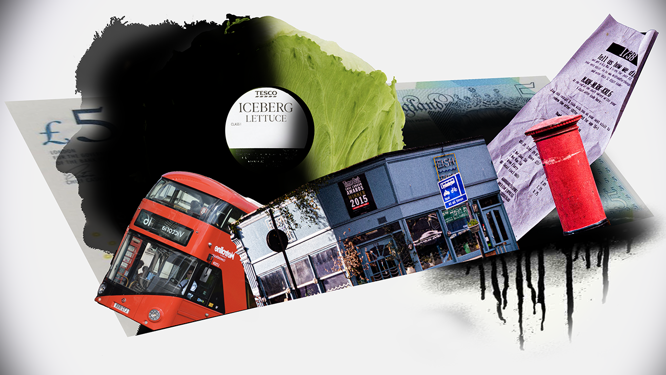
Ive chosen to focus on. themes relevant to modern England, these being the crash of the pound, and the 'cheaper' bills promised, I have also included the effect of these e.g old established local businesses going into bankruptcy with the fish fish restaurant. and I hade of course the image of the lettuce that outlasted the now resigned - ex prime minister, liz truss. also some things that will definitely tell you your in London - like the bus and the letter box. all of this riding of the back of the 5 pound note to show how the balance of things will and can be disrupted by minute changes in our economy.
WWW: Thematically rich and the critical tone towards life in London, well exposed framed original set of photos
EBI: image looks a bit drab as I didn't use the filter in photoshop known as posterize so it all looks a bit cheap, also the iceberg image and Liz truss were both taken off the internet and don't match the visual style depicted.
shooting conditions
grey skies and a bright day
ISO: 400 - 800
aperture: f8/10
shutter: 1/60th
side - development.
slinkachu
Stuart Pantoll, better known as Slinkachu, is a British street artist whose artwork is a mixture of sculpture, installation, street art and photography. He grew up in Devon and has lived in London since 2003. He trained in advertising while maintaining an interest in making miniature figures as a hobby.
he uses his skills at sculpture and his artistic eye to see the potential in waste, such as leftover bottles bubble-gum or a cigarette.
he creates mini scenes with micro people and its usually rather comedic as they depict such serious events on a tiny scale with objects regularly discarded with no care we see a man making the most of his overlooked environment creating these images...
I will respond to his style below-
Intentions of task.
With this shoot i wanted to exlude the problems humans create, leave behind and face - I wanted a small inconsequential scene with a touch of slinkachu's sense of humour.
I was required to take images of small people, railway figures are what slinkachu uses - since i dont own any railway figures it was obvious to use a lego man instead, my aim was to capture a small scale scene, a reflection on the day to day experiences we face, but with a tiny lego man - this below is the first set of images.


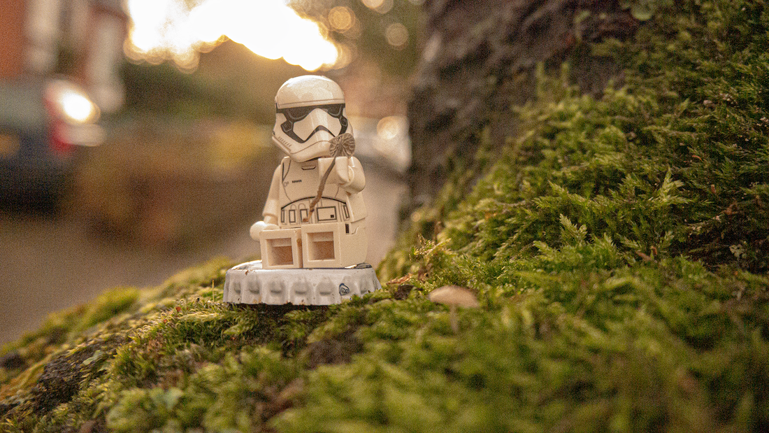

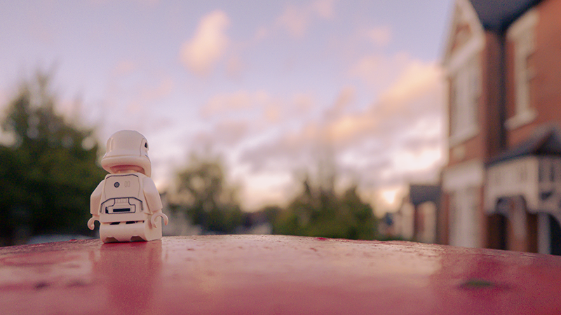
WWW: the images are quite nice and are rich in texture and vibrancy, the white stormtrooper figure pops out - and the images aren't dissimilar towards what Slinkatchu himself would photograph as some feature a slight tongue and cheek sense of humour, and I think art least - they have a sort of dream like look that's very easy to approach - there's not that much to that and its refreshing not having to take so much in at once.
EBI: had trouble balancing the iso as I wanted a very shallow depth of field and I tried to balance iso shutter and aperture resulting images have a lot of grain I didnt quite capture the scale of him either I tended to shoot up much closer than slinkatchu.
How the shoot went:
- lighting conditions were fine as we hit golden hour creating a very stunning source of light
-ISO : 3200 - 6400
-aperture : f4 - f2
-shutter 1/60th
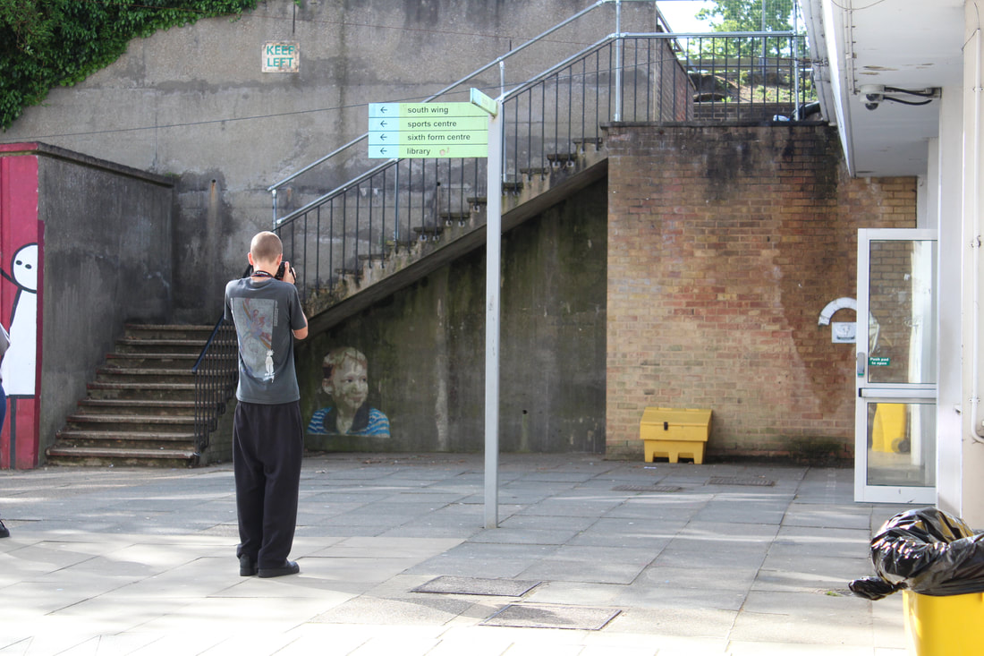
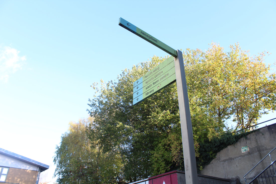
attempt no.2 (fortismere)
(returning back to miles donovan)
|

|
|
WWW - Good aspects of north wing chosen - with the current theme in mind, because this more foreward thinking it was much easier to edit the images out later.
EBI - images are out of focus and under exposed
shooting conditions -
blue sky - bright day some cloud little to no people obstructing as this was after school
ISO - 400-800
aperture - F.4
shutter - 1/60th
EBI - images are out of focus and under exposed
shooting conditions -
blue sky - bright day some cloud little to no people obstructing as this was after school
ISO - 400-800
aperture - F.4
shutter - 1/60th
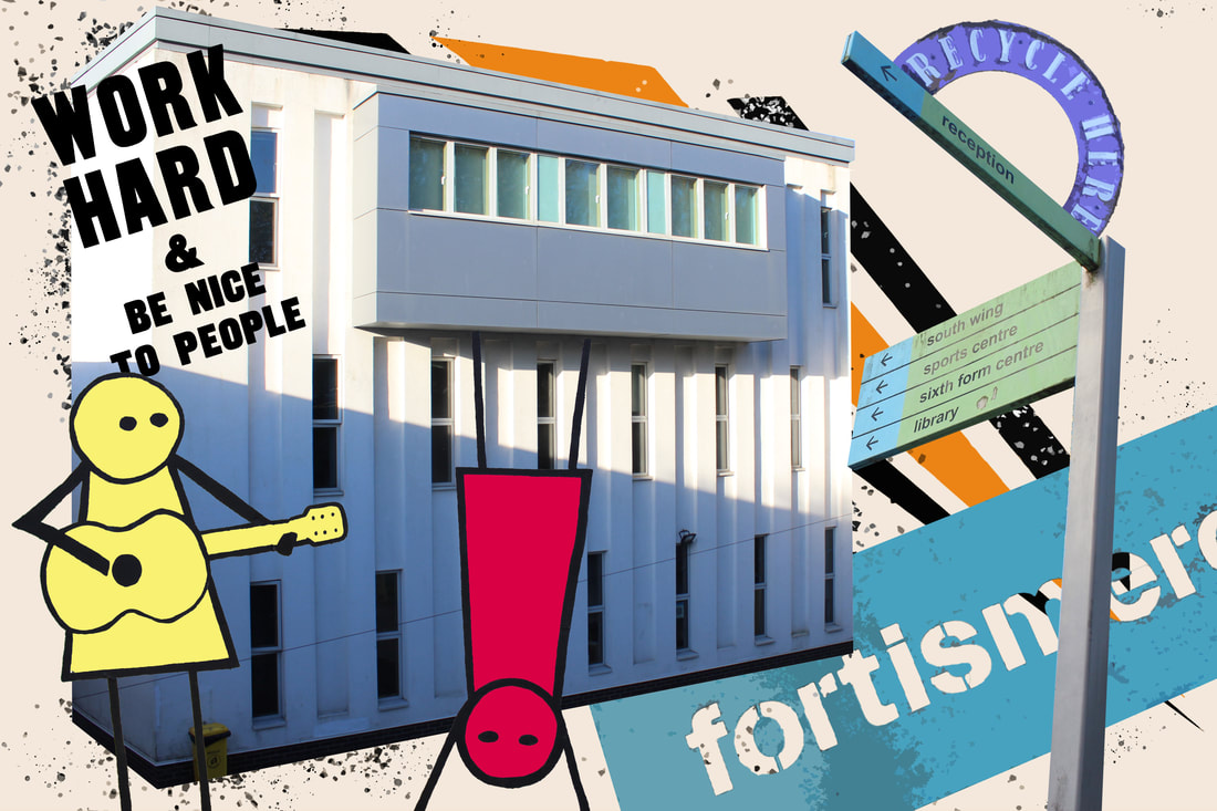
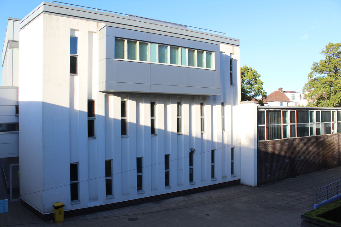
The image I think encapsulates the architecture of north wing modern and flashy but with a touch of nostalgia a building your sure you've seen before, I edited all the things in the image except the background I created that with the paintbrush tool, but everything else was shot end cropped out, it almost captures the genius loci depicted by Anastasia Savinova.
WWW. I think the image is more like the miles Donovan style as the colors are more matte and the background more colorful
EBI. the buildings still look off as they aren't posterized and fully matte like miles Donovan does, he completely stylizes the images taken until they are un - recognizable - or maybe it needs more things going on, as his style is very kitsch and "cluttered"
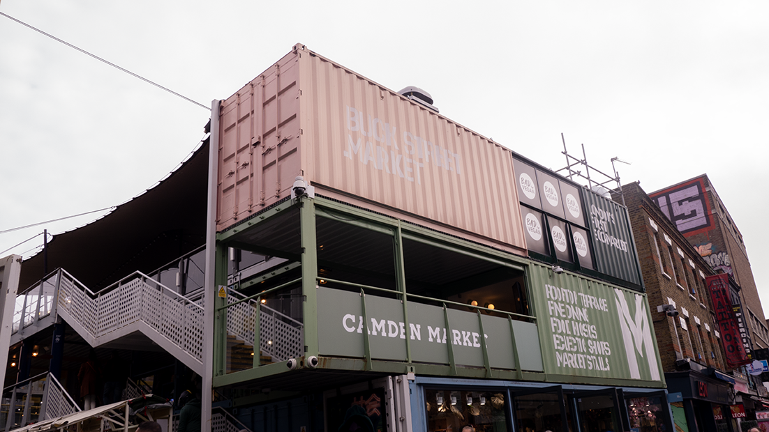
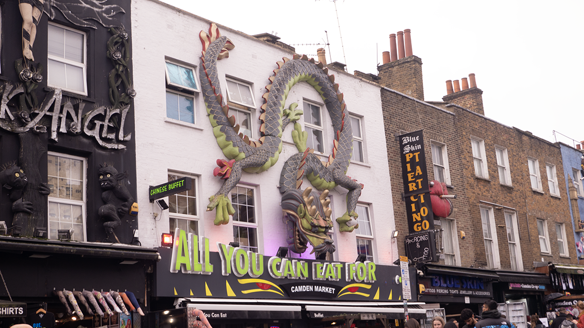
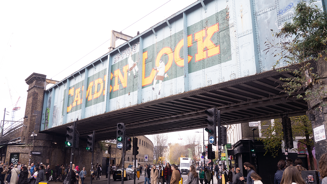
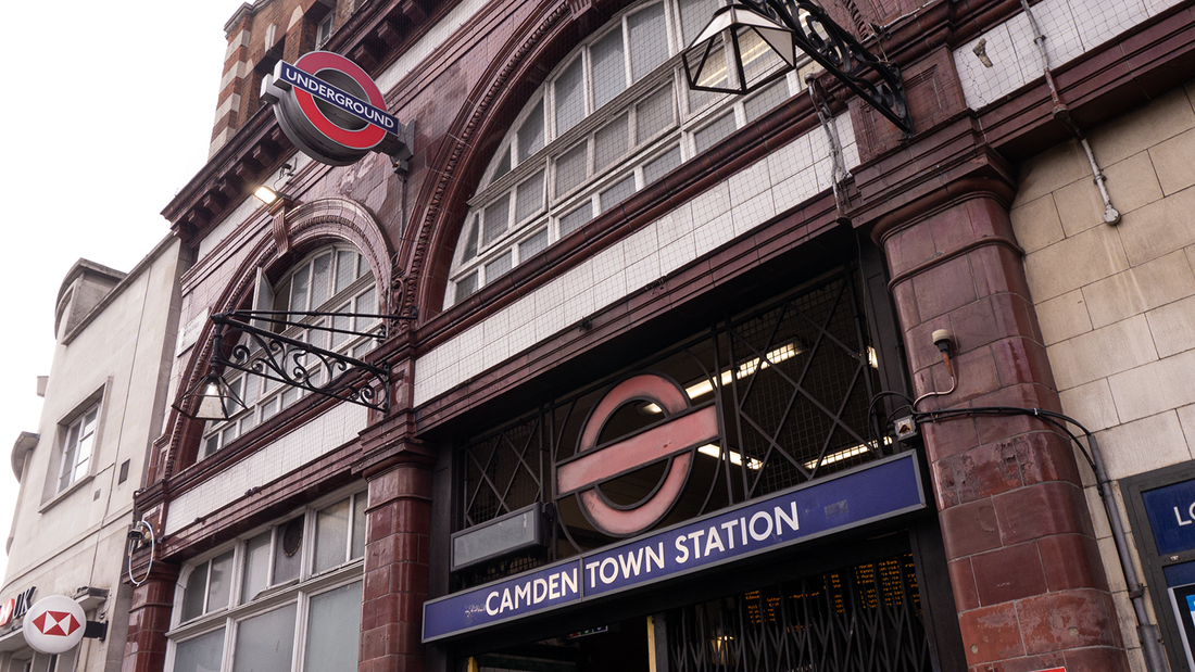
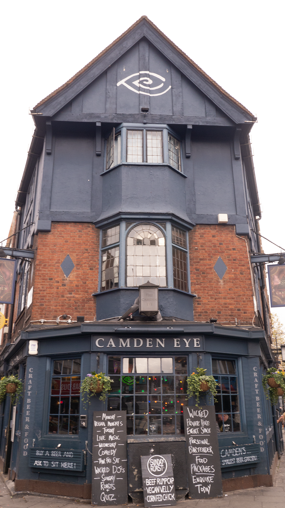
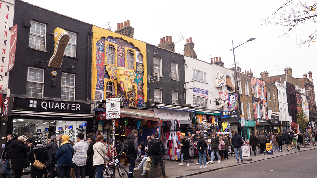
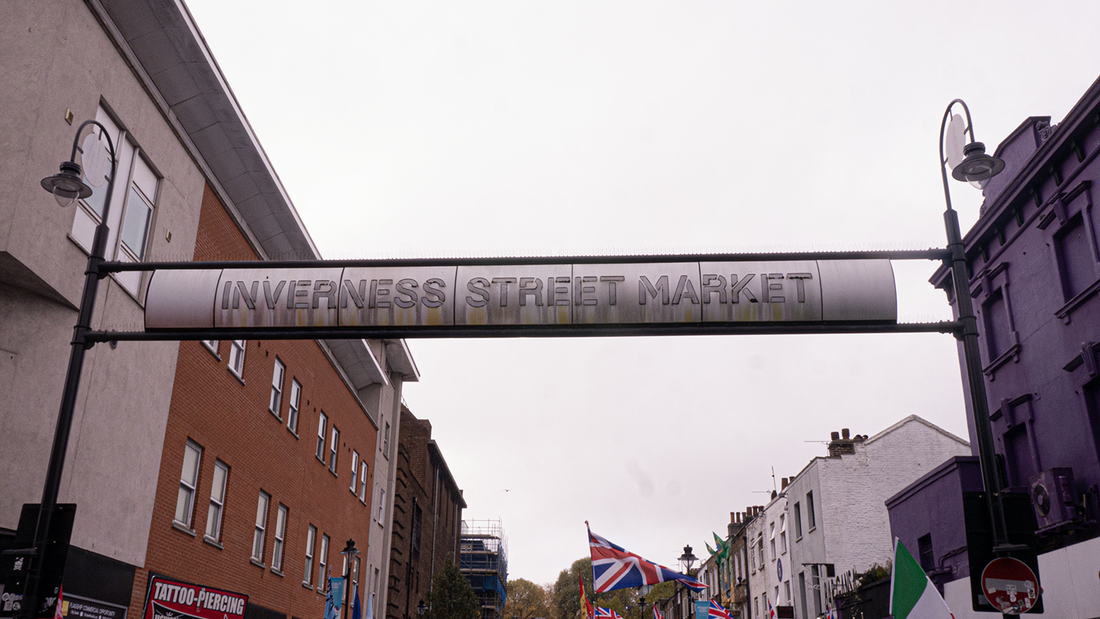
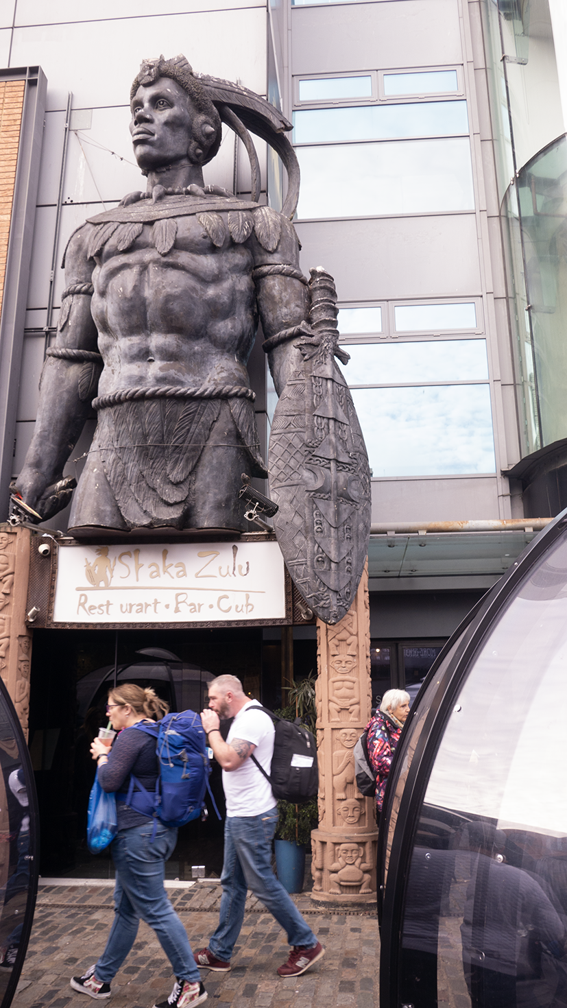
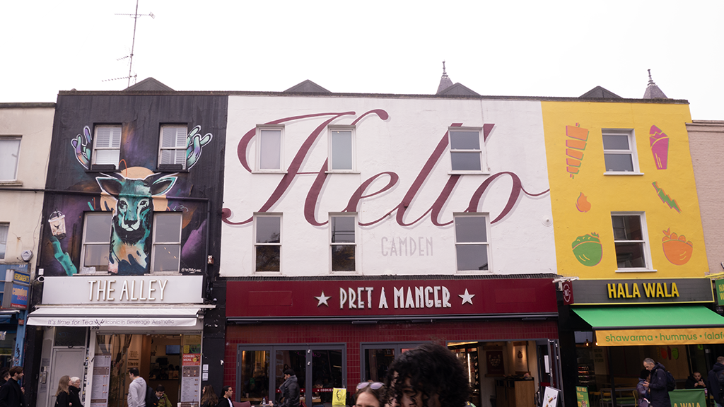
attempt no.3 (camden)
this time I will attempt to recreate the lively bright atmosphere of Camden or the genius loci as the romans called the spirit of a place, for people like miles donovan or anastasia savinova to create collages of them, unlike the last photo I will try and have more going on in this one.
|
|
|
WWW - images are go some of the first things to mind when Camden appears, I captured the eccentric neighbourhood and the colorful decorative buildings.
EBI - many images at a poor angle or out of focus - this affects the final product as it will never be as sharp as I would've liked
shooting conditions -
blue sky bright day some cloud, busy crowds and never a moment to hold still
ISO - 400-800
aperture - f.4
shutter - 1/60th
EBI - many images at a poor angle or out of focus - this affects the final product as it will never be as sharp as I would've liked
shooting conditions -
blue sky bright day some cloud, busy crowds and never a moment to hold still
ISO - 400-800
aperture - f.4
shutter - 1/60th
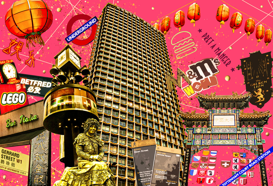
best edit
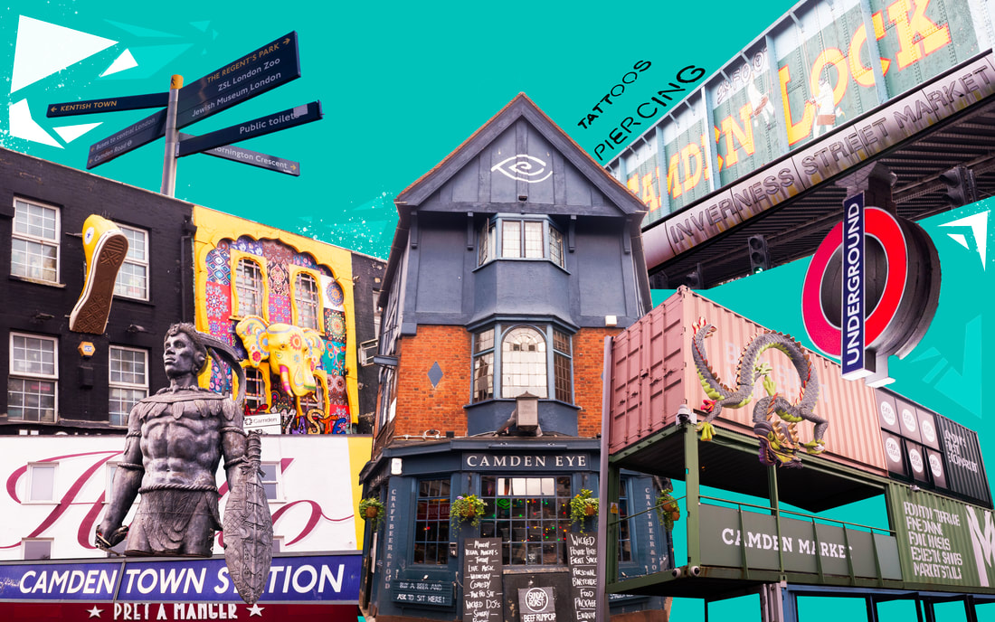
I think this is a great montage of Camden lively vibrant and very urban, the bright background suits that description and the images chosen I enjoyed the most as they were the most eye catching , and the overall composition I enjoy, each image was framed well and I selected and cropped them out of there original environment with the polygonal lasso tool, I tweaked all the levels, e.g the lighting the contrast and color balance, it was hard to take decent images as there were so many tourists and people walking but I am pleased with the result I used the higher iso to battle the faster shutter speed, I chose 1/60th as I didn't want any camera sway or people in the way before I got the perfect shot, but the main thing I am disappointed with is the low quality it doesn't do the proper file justice.
WWW - images and composition are strong and the over arching themes of the most vibrant neighborhood in London are represented well
EBI - the final image is very low quality as it was too big to put on Weebly, and I couldn't edit the layers with posterize ( the filter) as they were raw files too large a quality and the wrong file type.
below is the version that got posterized as I converted all files to a jpeg...
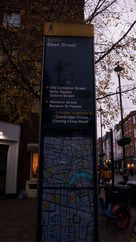
attempt no. 4 (soho)

|
|
|
WWW - I like the original set of photos, they are well exposed and framed well, meaning later when I edit the images it will be easier
EBI - Maybe some more images, or better angles some appear rushed - ( as they were)
shooting conditions -
bright cloudy day busy crowds, getting darker though
ISO - 800 - 1600
aperture - f.4
shutter - 1/60th
EBI - Maybe some more images, or better angles some appear rushed - ( as they were)
shooting conditions -
bright cloudy day busy crowds, getting darker though
ISO - 800 - 1600
aperture - f.4
shutter - 1/60th
editing the images ~
(the ones with black outlines - I didn't use)
- And of course repeat many times for each image,
If you follow your last image should look a bit like.....
final piece
Leave the sentences below at the bottom of the page for the whole project.
Copy and paste the sentences you want to use.
Annotation Support
Introducing a task:
Subject matter
What do you think the photographer’s intentions are? There may be more than one. ‘PEC’ each intention.
Miles Donovan creates mish mash, collages of selected (isolated) - elements and often plays with colour grading - or posturizing, and other effects. by this point his images look more like that of an illustration.
He does this by selecting photos cropping them out their original environment and pasting them in a new, well repeat this and edit each individually to create what looks nothing like the original.
He wanted us to consider the parts our brains focus on and when you remove the forgettable things you can summarise an area completely.
What wider issues is the photographer addressing?
Miles Donovan is considering, breaking all rules and crossing the lines between an image or an illustration
This is shown by the lack of proper composition, heavy editing techniques that leave the original set of photos unrecognisable
Miles Donovan was interested in this stylised - illustrative form of photography because he grew up spending lots of time around his fathers second hand store and saw many unique and kitsch items, and he used to draw them all tin a similar type of collage - now he's recreated that but with photography.
How do the materials and techniques used support your photographer’s intentions?
Miles Donovan has used digital manipulation techniques in creating this work.
This creates a jumbled and a mish-mash effect - the frequent use of logos pasted as a cartoonish 2D object.
This helps to support Miles Donovan's point about showing an identity behind locations and objects, as he explores areas and shows what he believes to be the true identity, by using a select few (memorable) images to create a vast mind map of the location chosen.
Copy and paste the sentences you want to use.
Annotation Support
Introducing a task:
- In this task I was required to crop out several images and put them in a stylised collage
- This task links to the theme, fragments as it shows fragments of what you remember of a place, the fragments that stand out, all put together to create a mind map of the diverse neighbourhoods and cultural hubs of London
- My intention was to respond to Miles Donovan because I wanted to explore the Kitsch art style in his vast portfolio
Subject matter
- The subject(s) I chose to photograph suited the theme as it encapsulates the different aspects of London and the positive effect immigration has had on the culture, architecture and the diversity of the city
- My composition helped to support my response to the theme by Not being that of a usual composition, the images rarely if ever follow the rule of thirds, balance or triangles as they are not traditional photographs, they are more of a collage and a summary of the borough
- I managed the exposure very well the camera settings were ISO - 800/1600. f.4. 1/60th
- I prioritised aperture to manipulate depth of field
- My images express my intentions which were a map of the big sights to see in all; the boroughs of the city
- EBI:
- Next time I should go to (brick lane or another diverse location), photograph at a different time of day, think more about my composition so that I can plan better for it and get the right images to match a plan, also maybe go later so there are less people - but that is hard in central London
- also due to the image size - the quality is poor because Weebly cant go above 10MB
- Next time I should use a tripod / use a different type of lens - I used a wide angle lens for almost every image on this website, I would rather use a super zoom lenses for the little logos further away as they were so far away, and their wasn't much time to get closer
- The concept wasn’t clear in my images, I need to make it more explicit by matching his style more appropriately before going off and doing my own thing
- I will experiment further with different locations, different lenses, planning and matching his style more effectively
What do you think the photographer’s intentions are? There may be more than one. ‘PEC’ each intention.
Miles Donovan creates mish mash, collages of selected (isolated) - elements and often plays with colour grading - or posturizing, and other effects. by this point his images look more like that of an illustration.
He does this by selecting photos cropping them out their original environment and pasting them in a new, well repeat this and edit each individually to create what looks nothing like the original.
He wanted us to consider the parts our brains focus on and when you remove the forgettable things you can summarise an area completely.
What wider issues is the photographer addressing?
Miles Donovan is considering, breaking all rules and crossing the lines between an image or an illustration
This is shown by the lack of proper composition, heavy editing techniques that leave the original set of photos unrecognisable
Miles Donovan was interested in this stylised - illustrative form of photography because he grew up spending lots of time around his fathers second hand store and saw many unique and kitsch items, and he used to draw them all tin a similar type of collage - now he's recreated that but with photography.
How do the materials and techniques used support your photographer’s intentions?
Miles Donovan has used digital manipulation techniques in creating this work.
This creates a jumbled and a mish-mash effect - the frequent use of logos pasted as a cartoonish 2D object.
This helps to support Miles Donovan's point about showing an identity behind locations and objects, as he explores areas and shows what he believes to be the true identity, by using a select few (memorable) images to create a vast mind map of the location chosen.
